How to conduct a website usability audit?


A visitor opens the website, finds a suitable product, and is about to place an order. However, the purchase button is obscured by a pop-up window, delivery information is hidden in the footer, and the registration form requires too much information. As a result, the user wastes time searching for information and may leave without completing the purchase.
A website usability audit can help identify such issues. This audit evaluates navigation, page content, interface performance, and the ease of performing key actions. Let's look at how to conduct such an audit yourself, what tools to use, and how to prepare a report with recommendations for developers.
What is website usability and usability audit?
Website usability is a measure of its ease of use. It measures how easily visitors can navigate the interface, find the information they need, and complete tasks without unnecessary interaction. The clearer the structure and behavior of elements, the fewer difficulties they encounter when interacting with the website.
A website usability audit is a systematic review of the interface, navigation, content, and user flows. The specialist examines the obstacles visitors encounter, identifies the causes of problems, and suggests solutions. The results are compiled into a report with specific comments, examples, and priorities.
What is the difference between usability, UX and UI?
These concepts are closely related, so they are often confused in service descriptions and technical specifications. However, each defines a specific area of work with a digital product. The difference becomes clearer when considering the example of an online store.
| Concept | What does it mean? | Example |
|---|---|---|
| Usability | Convenience of task execution | The buyer quickly finds the product and places an order |
| UX (User Experience) | Overall user experience | The buyer understands the terms, ordering process, and purchase outcome |
| UI (User Interface) | Visual and interactive interface elements | Buttons, fields, menus, icons, colors and states of elements |
Good usability design considers the clarity of the interface and human behavior during task completion. However, a pleasing appearance alone does not guarantee usability. A page may look neat but force the user to search for shipping costs or enter the same information multiple times.
Therefore, design and usability are assessed simultaneously, focusing on actual user actions. They examine visual hierarchy, navigation flow, the clarity of labels, and how quickly users achieve their desired result.
How does a UX audit differ from an SEO audit and usability testing?
A UX audit evaluates the quality of the user experience: how intuitive the product is, how easy it is to perform basic actions, and where difficulties arise. Usability audits typically focus on the usability of specific interfaces and scenarios. In practice, the scope of these studies often overlaps.
An SEO audit addresses different issues. A specialist checks indexing, URL structure, meta tags, internal links, technical errors, and page accessibility for search engines. Some issues, such as slow loading times or poor mobile navigation, are detected by both types of audits.
Usability testing involves the participation of representatives of the target audience. They are asked to perform specific tasks and observed for their decisions, errors, and difficulties.
Lead SEO specialist — Gennady
I don't consider usability a standalone, universal Google ranking factor. However, technical errors, mobile version issues, unclear structure, and poorly designed content can simultaneously hinder both visitors and search engine optimization. Therefore, I check SEO and UX together, but I don't mix their metrics and evaluation methods.
Answers to your questions
What is a website usability audit?
A website usability audit examines the usability of pages, interface, and key user scenarios. The study evaluates navigation, content, forms, mobile version, and other elements that influence visitor task completion.
The result is a report containing the detected issues, examples of how to reproduce them, and recommendations for remediation. The depth of the audit depends on the site's size, its functions, and the objectives of the investigation.
How to check website usability yourself?
To test this yourself, first identify the primary user actions: searching for a product, placing an order, submitting a request, or booking a service. Then, perform these actions sequentially on your computer and smartphone.
Record any issues that arise, and test the functionality of buttons, forms, and navigation. Additionally, use web analytics and session recordings if available. After testing, create a table of errors with page addresses, screenshots, and recommendations.
Is it possible to conduct a website usability audit for free?
A basic check can be performed for free using manual testing and available diagnostic tools. Google Analytics 4 helps study events and funnels, Microsoft Clarity helps analyze visitor behavior, and PageSpeed Insights helps analyze page performance.
However, free tools are no substitute for full-fledged user research. If you need to test a complex interface or gather feedback from audience members, additional resources and specialist input may be required.
How is a UX audit different from usability testing?
A UX audit may include an expert assessment of the interface, an analysis of analytics, and an analysis of user scenarios. The specialist reviews the product using available data and professional criteria.
Usability testing is conducted with representatives of the target audience. The researcher observes how people perform tasks, where errors occur, and which elements raise questions. These methods complement each other and help draw more substantiated conclusions.
What does a sample usability audit report look like?
The report is typically formatted as a table, with each issue on a separate line. It includes the page address, device, user scenario, error description, reproduction steps, and expected behavior.
Additionally, screenshots or videos are attached, a priority is assigned, and a responsible person is assigned. After the fix is completed, the results of a re-check are recorded. This format is convenient for handing off tasks to developers and monitoring changes.
How to evaluate the usability of an online store?
Start by searching for products using the menu and internal search, then check the categories, filters, and product cards. See how easy it is for shoppers to compare offers, find out prices, and find out delivery terms.
Next, test the shopping cart and checkout process. Make sure items are saved, the total cost is clear, and any form errors are explained. The main process should be completed on both a computer and a smartphone.
How often should a website usability audit be conducted?
The frequency depends on the number of changes, the complexity of the interface, and user behavior. After a redesign, launching a new catalog, or changing the ordering process, it's a good idea to test the affected scenarios.
For an existing website, a decline in conversion, customer complaints, or discovered technical issues may prompt a re-examination. In the absence of major changes, it's helpful to regularly review the most significant features and monitor the impact of previous fixes.
Why conduct a website usability audit?
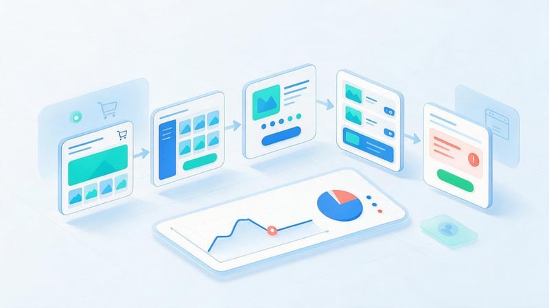
A user evaluates a website's usability based on how easily they obtain the desired result. For a buyer, this could be placing an order, for a patient, making a doctor's appointment, or for a bank client, clear loan terms. If the interface interferes with the desired action, the user is forced to seek a workaround or seek assistance.
Website usability analysis helps identify such barriers before a major redesign or after conversion issues arise. The findings are used to modify navigation, page content, forms, and action sequences. The effectiveness of these improvements is assessed based on visitor behavior and the results of follow-up tests.
When is website usability analysis necessary?
Changes in user behavior often prompt a review. For example, the number of visits remains the same, but requests are received less frequently, customers are abandoning items in their carts, or customers are constantly asking questions that are already answered on the website.
Conducting an audit is useful even without a noticeable drop in performance. This type of audit is especially important before launching a new product, after a design change, when expanding the catalog, or implementing complex user features.
The most common situations:
- Launch of a new website. It is necessary to test the main scenarios before a large number of real visitors appear.
- Interface redesign. It is necessary to ensure that the new structure retains the necessary functions and does not complicate the usual actions.
- Decreased conversion rate. It is necessary to find out at what stages users stop placing an order or application.
- Growth of mobile traffic. The interface should be tested on smartphones with different screen sizes.
- Change of functionality. It's a good idea to retest search, filters, forms, and other updated elements.
The audit timeframe depends on the frequency of changes and the number of problematic scenarios. A rapidly growing online store may require audits of individual functions significantly more frequently than a small informational website.
What indicators help evaluate the result?
Before testing, identify metrics related to specific user actions. For an online store, these might include adding items to the cart, proceeding to checkout, and completed purchases. For a service website, these might include form opens, successful application submissions, and clicks to contact information.
Conversion rates, task completion success rates, error rates, and scenario completion time are also used in the analysis. If visitors take a long time to complete a short form, it's worth checking the field labels, validation messages, and the necessity of the requested data.
Engagement reports and the conversion funnel provide additional insights. However, leaving a page doesn't by itself prove a problem: a person could have received a response and then completed their visit. Therefore, analytics metrics need to be compared with observations and testing results.
What methods are used for usability analysis?
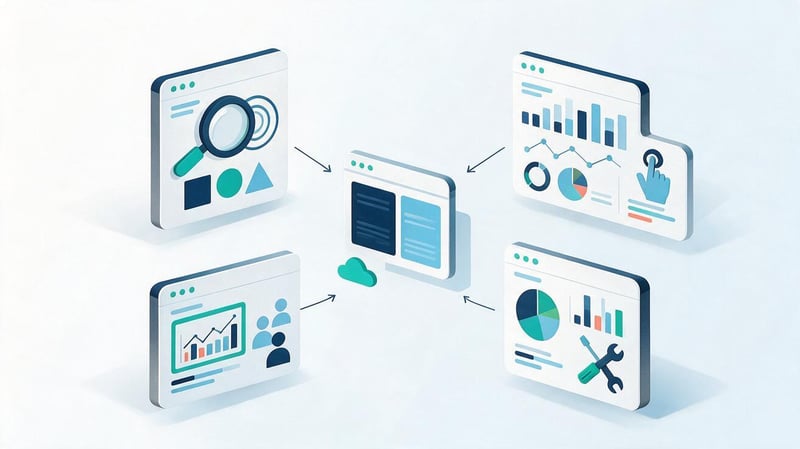
The choice of method depends on the website's objectives, the available data, and the nature of the suspected errors. Sometimes, expert review of basic scenarios is sufficient, while a complex interface will require user behavior analysis and a full-scale investigation.
Each approach has its limitations. Automated tools record specific events, experts notice violations of familiar interaction principles, and user testing reveals real-world difficulties. For more substantiated conclusions, the results of several methods are compared.
Interface expert evaluation
The expert assessment begins with checking key pages and performing typical user actions. The specialist goes through the scenarios one by one, paying attention to the clarity of labels, the logic of transitions, the predictability of button behavior, and the presence of feedback after actions.
Such a check may be based on well-known heuristic principles: interface consistency, error prevention, recognizability of elements, and the ability to undo actions. The checker also evaluates the information architecture, the availability of required functions, and the clarity of system messages.
For example, a form might clear all entered data after an error in one field. An expert will record this behavior, describe the consequences, and suggest saving the correctly entered information. To confirm the issue's impact on users, it's advisable to further study real requests or conduct testing.
User behavior analysis
Behavioral data helps identify pages and actions that require attention. In Google Analytics 4, you can examine the sequence of events, compare devices, and see at what points visitors abandon the target flow.
A more detailed picture can be provided by click maps, user session records, and data on interactions with individual elements. For example, visitors may repeatedly click on an image, mistaking it for a link, or attempt to close a pop-up window using a non-functional button.
Such observations help formulate a hypothesis, but require verification. User behavior depends on the traffic source, device, page content, and visitor intent. Therefore, usability analysis is best conducted for individual segments, rather than combining different scenarios into a single statistic.
Usability testing with users
For usability testing, people matching the target audience are selected and asked to complete pre-prepared tasks. Participants are asked to independently find information or perform an action, without explanation of the location of the necessary buttons and sections.
For example, a customer is tasked with finding wireless headphones at a certain price, checking delivery options, and adding the selected model to their cart. A researcher monitors the sequence of actions, recording errors, comments, and completion times.
A test task should describe the goal, not suggest a solution. A statement like “Click the price filter and select the desired value” predetermines the path, making it less suitable for research.
After several sessions, the results are compared, identifying recurring difficulties. Based on these, research hypotheses are developed, and it's checked whether the problems are related to the interface design.
How to choose the right method?
For a small service website, testing can begin with an expert assessment and analysis of available statistics. If the interface contains complex forms, multi-step registration, or non-standard features, it's useful to engage users and test their performance in real tasks.
The main differences between the methods are presented in the table.
| Method | What it helps detect | When to use |
|---|---|---|
| Expert audit | Unclear elements, logical violations, interface errors | Before launch and after changes |
| Web analytics | Problematic stages of the funnel, differences between segments | If there are configured events |
| Session analysis | Failed clicks, difficulties, repeated actions | To study specific pages |
| User testing | Mistakes and difficulties of real people | When testing important scenarios |
| Technical diagnostics | Loading, responsiveness, and interaction errors | At all stages of verification |
When choosing, consider access to statistics, the number of users, and the cost of the study. If data is limited, it's best to start with reproducible errors and specific scenarios, gradually expanding the testing.
How to conduct a website usability audit: a step-by-step guide
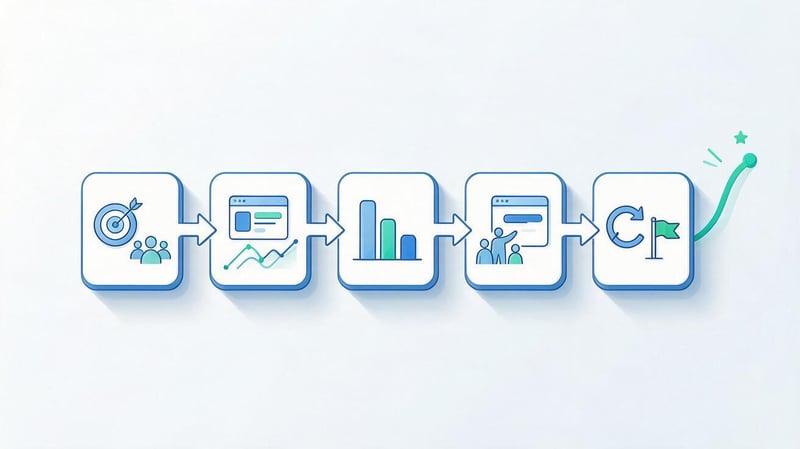
It's more convenient to conduct an independent website usability audit using a pre-defined plan. This helps ensure you don't miss important pages and maintain consistent testing conditions across devices. After completing each stage, you should have clear results: a list of scenarios, analytics data, observation logs, or a list of detected errors.
The sequence of work looks like this:
Test objective → audience → analytics → user scenarios → competitors → testing → priorities → corrections and control.
Step 1: Defining audit objectives
First, determine the objective of the audit. The phrase “improve the website” is too general, as it doesn't allow you to identify the necessary pages or understand which changes will be beneficial.
For an online store, the goal might be to find obstacles when placing an order; for a medical center, it might be to check appointment bookings; for a banking website, it might be to assess the availability of information about product terms and conditions.
Once you've selected your goal, create a list of key scenarios and metrics. Specify which pages are included in each scenario, which devices it should be tested on, and what results are considered successful.
If your website has several important areas, divide the review into separate tasks. This approach helps avoid a situation where most of your time is spent on the homepage's appearance, while the checkout is overlooked.
Step 2: Studying the target audience
The same interface may be convenient for one user group and difficult for another. For example, a regular customer quickly finds a familiar section, while a new visitor may be confused by the category names and ordering process.
Review support tickets, questions to managers, reviews, search queries, and previous research results. This data will help you identify the real needs of your users and the problems they're trying to solve.
Pay special attention to the context of use. A user might be placing an order on a smartphone, searching for a service while on the go, or comparing offers from several companies simultaneously. The context of interaction determines which interface elements require priority review.
Don't limit yourself to describing your audience by age and gender. For usability research, it's more useful to understand the user's level of familiarity with the product, their expectations, and the barriers that prevent them from completing the desired action.
Step 3: Collecting web analytics data
Before manually checking, review your existing data. In GA4, find pages with important user actions, verify that the configured events are correct, and compare visitor behavior on desktop and mobile devices.
If your website accepts applications, it's a good idea to track form openings, form start times, errors, and successful submissions separately. For a store, events such as product views, adding to cart, checkout start times, and purchases are useful.
Look for changes within comparable periods and segments. A decrease in conversion after launching an advertising campaign may be due to audience changes, so it can't be attributed solely to the interface.
Based on your analytics results, create a list of suspicious scenarios. For example, if mobile users are significantly more likely to abandon a particular step in the checkout process, check that screen manually and review the relevant session records.
Step 4: Testing user scenarios
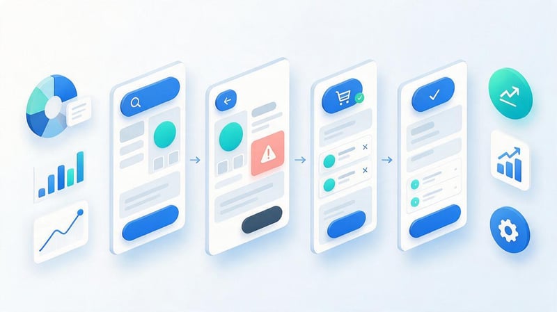
At this stage, the specialist navigates the website as a regular visitor would. Start with a real task and navigate the interface without using the admin panel, internal knowledge of the site's structure, or direct links to hidden pages.
For each action, record the expected and actual behavior. If a button doesn't respond, a form loses data, or the user is taken to an unexpected page, record the sequence of steps and take a screenshot.
Test a new session separately, as saved settings may mask first-visit issues. Repeat important actions on your smartphone, and if necessary, in different browsers and at different interface scales.
The result should be a user flow map indicating the obstacles found, not a list of subjective impressions about the site's appearance.
Checking the service website
For a service website, the main scenario usually begins with searching for a suitable offer. The visitor needs to understand what services are available, how they differ, how the pricing is determined, and how to contact the company.
Check the link from the menu to the service, the completeness of the description, the location of the contact information, and the ease of use of the booking form. If the price can't be specified in advance, it should be clear to the visitor what it depends on and how to get a quote.
Run through the process from the first visit to request confirmation. Check whether data is saved after errors and whether the user understands that the request was successfully submitted.
For medical, financial, and other sensitive topics, double-check the accuracy of terms and conditions and warnings. Unclear wording can influence a visitor's decision even if the interface is technically sound.
Online store check
The usability of an online store should be assessed throughout the entire purchase journey, starting with the product search. Check the category names, filter functionality, sorting, and the ability to return to the results after viewing the card.
In a product card, buyers need information about specifications, price, availability, images, delivery terms, and the ability to select the appropriate product option. If information is scattered across multiple sections, comparing offers becomes more difficult.
The next step is the shopping cart and checkout. Make sure the user can change the quantity of items, delete an item, view the total price, and select a delivery method without losing their data.
Pay special attention to the mobile design. An awkward keyboard, small elements, and unexpected transitions can discourage purchases even if the desktop version works properly.
Step 5: Analysis of competitors' websites
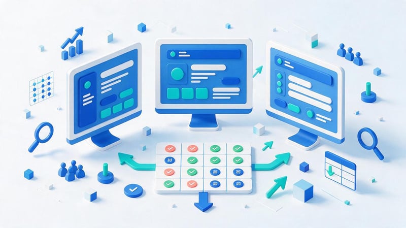
Competitive analysis helps identify alternative ways to organize similar user tasks. Select several websites in the same niche and compare how they organize search, categories, product pages, forms, and checkout.
For an objective comparison, run identical scenarios. For example, try searching for a specific service on each website, checking the price, and submitting a request. Record the number of steps required, any difficulties encountered, and the availability of information.
Note successful solutions, but consider differences in audiences and business processes. A feature useful for a large marketplace may be unnecessary for a small store with a limited product range.
Present the comparison results in a table with specific observations. In your recommendations, explain what user problem the proposed change solves, rather than simply referencing the competitor's interface.
Step 6: Conducting user testing
Prepare several tasks that reflect the audience's key needs. Each should have a clear outcome: find information, compare options, submit an application, or complete a purchase.
Select participants who match the intended site users. Before beginning, explain the study rules, obtain the necessary consents, and encourage them to complete the tasks independently.
During testing, do not prompt the participant about the placement of elements or correct their actions. Record the sequence of transitions, errors, execution time, and comments that help you understand any difficulties encountered.
After completing several sessions, compare the results and identify recurring issues. Individual observations can also be helpful, especially if it's a blocking error, but they can't be automatically generalized to all visitors.
Step 7: Systematizing errors and setting priorities
After the review, a list of comments of varying severity typically appears. This list might include a non-functional checkout button, insufficient text contrast, and poor placement of a secondary icon.
For each issue, estimate the impact on task completion, the number of affected users, and the availability of supporting data. Then, determine the complexity of the fix and its dependencies on other work.
Use clear priority levels: critical, high, medium, and low. A critical defect might be one that blocks the site's core functionality, while a low priority might be a minor inconvenience that has little impact on the scenario.
Prioritization helps communicate a consistent plan to developers. It's a good idea to agree on criteria in advance so that the decision on a bug's importance isn't solely dependent on the reviewer's personal opinion.
Step 8: Preparing recommendations and re-verification
The final stage begins with organizing the identified issues into developer tasks. Each task should contain the page address, the test conditions, a description of the error, the expected behavior, and a specific recommendation.
After making changes, repeat the original scenarios on the same device types. Verify the issue is resolved and ensure that the fix has not impacted adjacent features or interface elements.
Then compare the available metrics before and after implementation. If the expected changes haven't occurred, revisit your initial hypothesis and explore possible causes.
A single audit rarely covers all user experience issues. As a website evolves, its features, audience, and terms of use are updated, so the most important scenarios should be reviewed regularly.
What to check during a website usability audit: a detailed checklist

A website usability checklist helps you evaluate different pages equally and remember details that are easily missed during a casual viewing session. The check is conducted across a range of criteria: navigation, content, design, forms, commercial scenarios, mobile version, performance, and trust.
Each item should answer a specific question that can be tested with action. Instead of saying “user-friendly menu”, it's better to use the criterion “the visitor can find the desired section from any main page template”.
Site structure and navigation
A clear website structure helps visitors predict where the information they need can be found. Section titles should align with the content, and similar actions should work consistently across pages.
Check the navigation menu, breadcrumbs, internal search, and product filtering. Users should be able to understand their position in the structure and return to the previous level without losing their settings.
Look for empty categories, duplicate menu items, and links that lead to unexpected pages. Check the messages when no search results are found and the suggested alternative actions.
For a large catalog, it's helpful to evaluate the logic behind product grouping. If category names are only understood by company employees, users may select the wrong sections and waste unnecessary time.
Content and information architecture
Even high-quality text becomes cumbersome if it's difficult to scan or important information is hidden among unimportant details. Headings should help navigate the content, and the order of blocks should correspond to the sequence of visitor questions.
Check the readability of the text, paragraph length, list formatting, and clarity of terminology. Ensure product and service descriptions include the necessary specifications, terms, and limitations.
Tables and interactive blocks deserve special attention. On narrow screens, tables should remain accessible, and hidden sections should have clear labels and statuses.
If a page contains multiple language versions, check the quality of the translation of the interface and content. Mixed languages in buttons, forms, and navigation hinder comprehension, even with a well-organized structure.
Interface design and accessibility
Design evaluation begins with checking visual consistency. Buttons with the same function should look similar, selected elements should be distinct from others, and loading or error states should be noticeable to the user.
Check text contrast, font size, spacing between elements, and the legibility of labels. Accessibility of forms is crucial: users should understand the purpose of a field and the cause of an error without having to guess at the system's requirements.
The WCAG 2.2 guidelines can be used to assess accessibility. They cover various interaction modes, including keyboard navigation, visible focus, interface clarity, and the use of assistive technologies.
Automatic checking identifies some issues, but does not confirm full compliance with accessibility requirements. A final assessment requires manual keyboard checks and, depending on the task, additional testing with assistive technology.
Forms, buttons, and conversion elements
Forms are often the last hurdle before receiving an application or placing an order. Therefore, review them especially carefully, from the moment you open them until the successful submission message appears.
Ensure required fields are marked, the input format is clear, and errors are displayed next to the relevant fields. If a user makes a mistake in their phone number, the already-filled name and comment should be preserved.
Each CTA button should have a clear label and predictable behavior. The visitor should understand whether the form will open, the order process will begin, or the user will be redirected to another page.
Check protection against duplicate submission, keyboard accessibility, and interface responsiveness on slow connections. Also, test any service unavailability or temporary error messages.
Product cards, shopping cart, and checkout
A product page needs complete information and the ability to compare the offer with alternatives. Buyers need to see the price, specifications, available options, availability, and delivery details.
Check the images, feature selection, and size/configuration selection. When features change, the price and availability should be updated clearly.
The user should be able to see the order contents and the total amount in the shopping cart. Changing the quantity, deleting an item, or returning to the catalog should not result in the loss of the remaining items.
During checkout, check whether registration is mandatory, as well as address entry and payment and delivery methods. Any additional fees or restrictions must be disclosed before final confirmation of purchase.
Usability of the mobile version of the website
On a smartphone, the user has access to a smaller screen area, making long forms, cluttered menus, and awkward interactive elements particularly noticeable. A mobile website should retain core functionality without requiring horizontal scrolling of the entire page.
Test the functionality of menus, modal windows, filters, and buttons on devices with different screen widths. Ensure that fixed elements don't overlap content, and that an open keyboard doesn't obscure the active field.
For touch controls, the size of the tap targets and the spacing between adjacent elements are important. Additionally, check the accessibility of functions when the interface is zoomed in.
Browser emulation helps quickly identify responsive design errors, but it doesn't replicate all the features of a real device. It's recommended to further test key scenarios on Android and iOS smartphones.
Loading speed and technical errors
Slow loading and unstable page behavior can negatively impact the user experience. For example, a visitor might click a button that has moved while an image is loading, or resubmit a form because the interface is unresponsive.
Core Web Vitals are used to check performance: LCP characterizes the loading of the main content, INP characterizes the responsiveness of the interface, and CLS characterizes the visual stability of the page.
Check for JavaScript errors, broken links, image loading issues, and incorrectly displayed elements. Pay attention to slow connections and page reloads.
Technical diagnostics help identify specific issues, but they don't replace user experience assessment. Even a fast-loading website can have difficult navigation and complex forms.
Trust and commercial information
Visitors need to understand which company they are dealing with and what terms and conditions apply when placing an order. Therefore, information about the seller or contractor, contact information, and essential terms and conditions should be available on the relevant pages.
Check the contact information, payment details, delivery, return, and personal data processing policies. If reviews are published on the website, they should reflect actual customer interactions.
Pay particular attention to financial, medical, and other pages where a mistake in the terms and conditions could influence a user's decision. Restrictions, additional fees, and warnings should not be hidden in inconspicuous elements.
Avoid interface solutions that create artificial urgency or force visitors to accidentally agree to unnecessary services. Transparent terms and conditions help users make informed decisions.
Website audit summary checklist
| Criterion | Check question | Typical problem |
|---|---|---|
| Navigation | Is it possible to quickly find the section you need? | Unclear names of items |
| Search | Does search take into account real queries? | No useful results |
| Content | Are the main conditions visible? | The information is hidden in the text |
| Design | Are the buttons and states distinguishable? | Low contrast of elements |
| Forms | Is it clear how to fix the error? | No explanation |
| Cart | Is it possible to change the order contents? | Items are lost when changing |
| Mobile version | Are all basic actions available? | Buttons overlap content |
| Speed | Is the interface stable? | Element shifts during loading |
| Trust | Are the terms and contact information available? | Hidden limitations |
It's more convenient to use this checklist in conjunction with a table of comments. For each detected defect, you need to save the page, device, reproduction steps, and expected behavior.
Lead SEO specialist — Gennady
When I assess a website's usability, I primarily check not the appearance of individual blocks, but whether the visitor can complete their task. If a person can't find a service, compare terms, or submit a request, a beautiful design won't solve the problem. Therefore, it's important to simulate real user scenarios during the audit, identify obstacles, and verify whether changes help eliminate them.
Free tools for website usability testing
A free website usability audit can begin with manual testing and tools that collect data on performance and visitor behavior. A basic study doesn't necessarily require expensive software, although certain tasks may require paid features or the involvement of test participants.
The choice of services depends on the information you need to obtain. One tool shows the sequence of events, another helps you examine session records, and a third identifies technical loading issues.
Google Analytics 4
Google Analytics 4 is suitable for studying user behavior across different pages and stages of the conversion process. It allows you to compare traffic sources, devices, events, and navigation sequences.
Funnel studies are particularly useful for usability analysis. If form start and successful submission events are configured, a specialist can see how many users reached each stage.
It's important to first verify the accuracy of the measurements. A missing event in a report is sometimes due to an analytics error, not to visitor behavior.
For more detailed research, it's useful to segment users by device type and key scenarios. This helps identify issues that are often lost in overall website statistics.
Microsoft Clarity
Microsoft Clarity collects user session records and creates interaction heatmaps. The service helps study clicks, scrolling, and visitor actions on individual pages.
For example, recordings may show that people repeatedly click an element without the expected response. After detecting this behavior, a specialist manually inspects the interface and determines the cause.
When working with recordings, it's important to consider privacy requirements and properly configure the masking of sensitive information. Before launching, review the data masking settings and user notifications.
Session recordings are especially useful for testing specific hypotheses. Reviewing a large number of random recordings without a defined objective can be time-consuming and yield unclear results.
Google PageSpeed Insights and Lighthouse
Google PageSpeed Insights helps you check your page's performance on mobile devices and computers. The service uses lab measurements and, where sufficient data is available, real-world user experience data.
The report examines LCP, INP, and CLS, as well as provides recommendations for troubleshooting slow loading and unstable rendering. Lighthouse also provides diagnostic checks for performance, accessibility, and certain technical aspects.
When evaluating, consider the differences between lab and field data. Controlled test results do not always fully reflect how a website performs on real visitors' devices.
Separate testing is necessary for forms, navigation, and purchase scenarios. A high PageSpeed Insights score does not confirm that the user is comfortable performing these actions.
User testing tools
Specialized platforms, such as Maze, are used to organize user research. They help prepare tasks, collect results, and analyze scenarios.
However, website usability testing can be started without a separate platform. Simply prepare tasks, invite audience members, and monitor their actions with the necessary recording permissions.
When choosing a service, check the current pricing, limitations, and data export options. Free plans may vary in the number of studies, participants, and available features.
If this is your first study, it's a good idea to start with a few relevant scenarios. Once initial results are obtained, you can expand the sample and test new hypotheses.
| Tool | Main purpose | Free to use |
|---|---|---|
| Google Analytics 4 | Events, segments, funnels | The basic version is free |
| Microsoft Clarity | Heat maps, session recordings | Free service |
| PageSpeed Insights | Loading speed and stability | Free check |
| Lighthouse | Technical diagnostics of pages | Free tool |
| Maze | User research | The terms of the free plan need to be clarified |
For independent, free website usability analysis, it's more convenient to combine analytics with manual user scenario analysis. This approach helps connect statistics to specific barriers and develop testable recommendations.
Website usability audit example: errors and recommendations
Let's look at a case study of an audit of an online home appliance store. A customer wants to find an electric kettle, check delivery costs, and place an order from a smartphone. During the audit, the specialist goes through these steps sequentially and records any obstacles that prevent the purchase from being completed.
This example is hypothetical: the errors and recommendations identified illustrate the research format, not the results of a specific store inspection. For a real project, each issue must be confirmed by reproduction or additional data.
What errors were found?
In the hypothetical example, the test revealed several obstacles. Some affect the execution of basic actions, while others complicate information retrieval and require additional navigation.
The results can be presented as follows.
| Element | Problem discovered | Recommendation | Priority |
|---|---|---|---|
| Mobile menu | It overlaps content and interferes with scrolling | Fix menu behavior | High |
| Filters | Reset after returning from the product page | Save selected parameters | Medium |
| Product card | Delivery terms are difficult to find | Place information next to the purchase | Medium |
| Order form | Doesn't explain the reason for the error | Add clear validation | High |
| Confirmation | After sending there is no clear result | Show order status | High |
For each error, it's important to determine the consequences. For example, resetting filters forces a repeat search, while a missing order confirmation may require a resubmission of the form.
The priorities in the table are preliminary. In a real project, they are refined based on the impact on users, the prevalence of the problem, and the difficulty of fixing it.
What does a well-designed UX recommendation look like?
The general comment “the form is awkward” is almost impossible to verify after changes have been made. The developer requires a specific description of what is happening and what the expected result is.
Example of task formatting:
Page: placing an order, mobile version.
Problem: After submitting a form with an incorrect phone number, the field is highlighted, but there is no message indicating the reason for the error.
Reproduction steps: Open the order form, fill in the required fields, enter the phone number in the incorrect format and click the confirm button.
Expected behavior: A clear message appears next to the field with an example of the acceptable format. The remaining correctly entered data is saved.
Recommendation: Add an accessible text error message and test the validation logic on a smartphone and a computer.
Checking the result: Repeat sending with the incorrect and correct number, making sure that the interface behaves correctly.
This description can be included in the task management system without further retelling. A screenshot of the problematic state and a video recording of the reproduction will help the developer quickly understand the situation.
How to evaluate changes after corrections?
After implementing the recommendations, it's necessary to repeat the initial user scenarios. If the form didn't previously explain the cause of the error, verify that the message now appears and actually helps correct the data.
To evaluate results, you can compare the number of successful submissions, error rates, and task completion time. The data should be considered in light of traffic sources, seasonality, and other site changes.
If a suitable audience and sufficient data are available, individual solutions can be tested through A/B testing. This type of experiment helps compare interface options under more controlled conditions.
Without measurement, it's impossible to claim that a fix automatically increased sales. Even a well-implemented recommendation requires testing in real-world user scenarios.
Initial conditions and test scenario

The check begins on the mobile version of the homepage. The user opens the catalog, selects a household appliance category, and attempts to find a kettle within the specified price range.
After applying filters, the buyer opens the product page, reviews the specifications, and proceeds to checkout. The main goal is to complete the purchase and receive a clear confirmation.
During the test, the specialist records the sequence of actions, the number of required transitions, and the problematic elements. For each error, the URL, device model or screen parameters, and reproduction steps are saved.
Test conditions are recorded in advance so that another specialist can repeat the check. This is especially useful for intermittent errors that only appear after certain actions.
How to create a website usability audit report?
The report should help the team reproduce issues, understand their impact, and monitor fixes. A document with dozens of screenshots without explanations is difficult to use, especially when tasks are divided between a designer, a developer, and a content manager.
It's more convenient to track the results in a table, with each observation on a separate line. For complex cases, screenshots, screen recordings, and a detailed description of the expected behavior are added.
Report structure and table template
It's a good idea to prepare a website audit template before beginning the audit. This will allow errors to be recorded in a consistent format and avoid situations where devices, page addresses, or reproduction steps are missing for some issues.
The minimum report structure includes the following fields.
| Field | What to indicate |
|---|---|
| ID | Unique comment number |
| URL | Address of the problematic page |
| Device | Device type, browser, screen size |
| Scenario | Actions performed by the user |
| Problem | Observed incorrect behavior |
| Steps | Reproduction sequence |
| Proof | Link to screenshot or recording |
| Recommendation | What needs to be changed |
| Priority | Critical, high, medium, low |
| Responsible | Task performer |
| Status | New, in progress, done, verified |
| Result | Results of the re-check |
This website audit checklist can be maintained in Google Sheets or Excel. If you have a large number of comments, it's helpful to add filters by page templates, devices, and assignees.
Create a separate summary: the number of issues found, the number of critical errors, and the main scenarios requiring fixes. This will help the site owner understand the scope of the work without having to review every line.
How to prioritize fixes?
Priority depends on how significantly the error interferes with the user's ability to complete a task. For example, a non-functional buy button typically requires a faster fix than a minor deviation from the approved visual design.
When assessing the issue, consider its prevalence, the availability of supporting data, and the number of users likely to encounter it. Additionally, consider the complexity of the fix and any dependencies on other tasks.
For complex projects, a separate priority matrix is useful. One axis represents the impact on the user scenario, the other represents the implementation costs. This allows you to prioritize changes that need to be implemented first.
However, low labor intensity alone does not make a task important. Critical obstacles must be eliminated regardless of how complex the solution development turns out to be.
How to improve website usability after an audit?
Improving website usability begins with implementing specific recommendations confirmed by testing. If a report reveals dozens of issues, it's not necessary to address them all at once. It's more convenient to create a coherent plan with priorities, responsibilities, and completion criteria.
The first changes typically address obstacles that interfere with core user actions. Once these are resolved, you can move on to navigation, page content, and visual details.
Fixing critical issues
First and foremost, it's necessary to fix any errors that block purchases, bookings, application submissions, or other key website functions. These include broken forms, inaccessible buttons, and glitches when navigating between checkout steps.
After each fix, repeat the corresponding scenario in its entirety. For example, restoring the button's functionality may not be sufficient if the next step results in a data saving error.
Pay special attention to the mobile version and browsers used by your primary audience. A fix tested only on the developer's computer does not guarantee consistent behavior in all conditions.
Record the results in a report: change date, performer, tested scenarios, and remaining limitations. This will help you revisit the issue if it reappears after the next website update.
Improving navigation, content, and design
Once critical errors are resolved, you can move on to more complex but workable scenarios. For example, reducing the number of steps before ordering, making section names clearer, or changing the layout of delivery information.
Recommendations for improving website usability should take into account user habits. If people regularly search for a specific category using the internal search, it's worth checking its position in the navigation.
Content changes also require review. A rewritten instruction may be shorter but lose important information, so it's important to evaluate the clarity and completeness of the information.
Don't launch a full-scale redesign simply because of isolated interface issues. Local fixes can often resolve specific issues without changing the overall project structure.
Testing hypotheses and monitoring results
After implementing the changes, compare the baseline metrics with the new data. For the application form, this could be successful submissions and submission errors, and for the catalog, this could be search and filter usage.
Interpret analytics changes with caution. Results may be impacted by advertising campaigns, product range, seasonality, and technical updates that occurred concurrently with UX changes.
If data allows, conduct separate experiments with the most significant decisions. For smaller sites with limited traffic, repeated user testing may be more useful.
Continue collecting customer feedback and recording new issues. Regular testing helps you spot errors after adding features and changing user scenarios.
Common mistakes in independent usability audits
The first common mistake is judging a website solely by its appearance. A neat design doesn't guarantee a clear checkout process, and an unfamiliar layout doesn't necessarily prevent users from completing their task.
The second error is related to limiting the verification process to the homepage. The main difficulties often arise in the catalog, product page, booking form, and other sections that the user visits after the initial landing page.
The third problem is the lack of device differentiation. The interface may work correctly on a widescreen but still contain blocking errors on a smartphone.
Another mistake is relying unconditionally on automated assessments. PageSpeed Insights, Lighthouse, and other tools detect certain technical issues, but they cannot fully assess the clarity of texts or the ease of finding the desired service.
Self-testing becomes significantly more useful if conducted according to predetermined scenarios. It's important to document reproducible issues and separate actual observations from personal preferences.
An equally common situation is a lack of prioritization in the report. The developer receives a long list of comments but doesn't understand which ones hinder users and require immediate correction.
The last mistake is to stop working immediately after submitting recommendations. Without retesting, it's impossible to confirm that the fixes have resolved the original issues and haven't introduced new ones.
What is included in a website usability audit?
An audit typically includes checking the website's structure, navigation, content, visual design, forms, and key user scenarios. Additionally, the website's mobile version, interface accessibility, loading speed, and clarity of terms and conditions are assessed.
Depending on the task, analytics, expert assessment, and user testing may be used. The final document contains the identified errors, supporting materials, priorities, and specific recommendations for correction.
A usability audit helps identify specific obstacles that prevent visitors from using your website. Start with key scenarios, test them on different devices, analyze analytics data, and compile the findings into a clear report.
It's best to implement fixes in a prioritized manner and then re-test them. This approach allows for consistent improvements to the site's usability while maintaining control over the results.
If your review requires an independent expert assessment, contact Seo-Gen. We'll help you identify interface issues, prepare recommendations for developers, and determine the order of fixes.


